
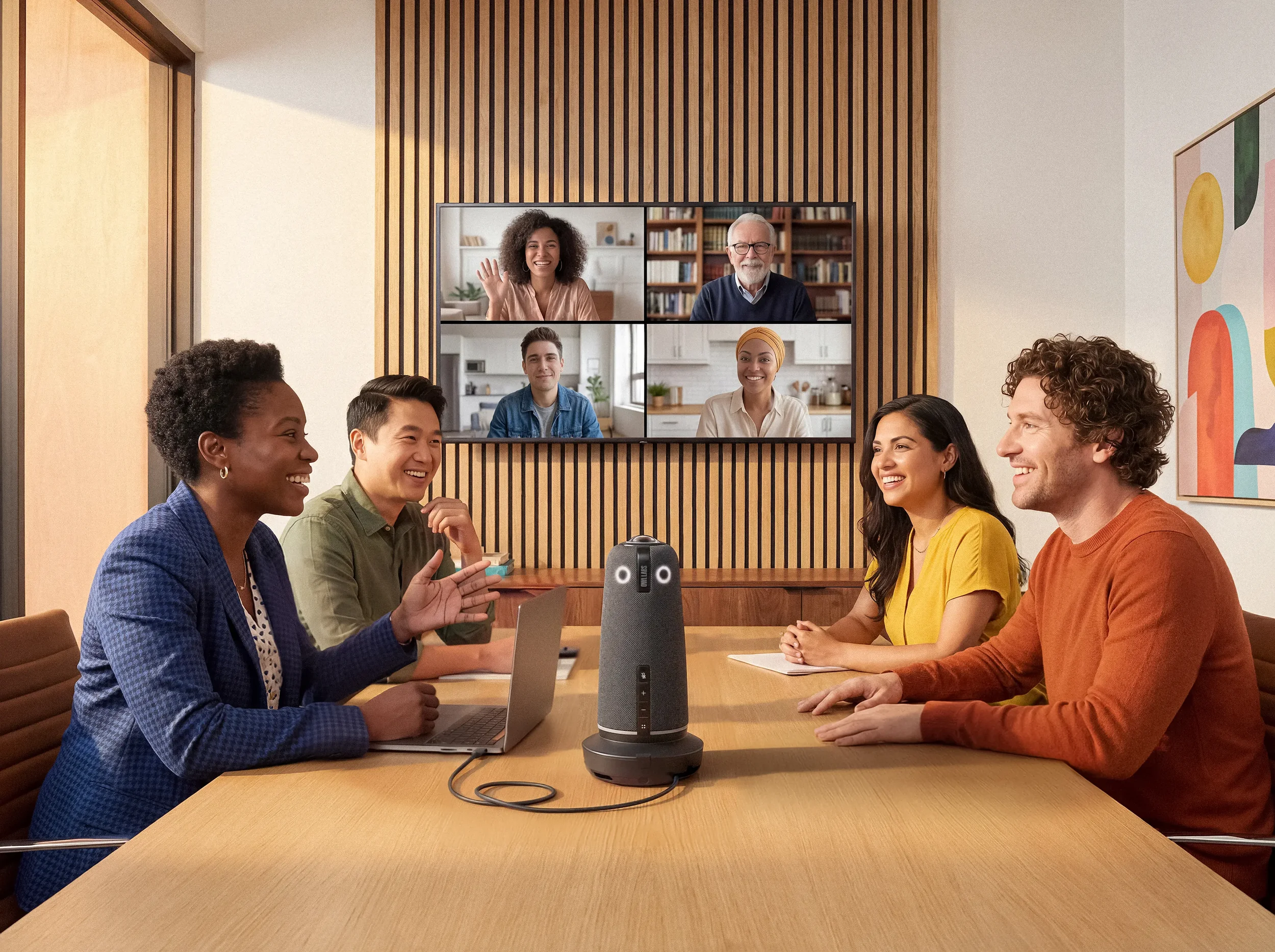
Owl Labs makes some of the most thoughtful hybrid meeting technology on the market — 360-degree cameras built around a genuine belief that remote participants deserve to feel as present as the people in the room. They’d invested in a significant rebrand with a top-tier agency. The brand voice was warm, people-first, and distinctive.
None of it was showing up on the website.
Design & Creative Direction. Thomas Bolte
Strategy. Eliana Doering and Nishma Maskey
Development. Ian Ohlman
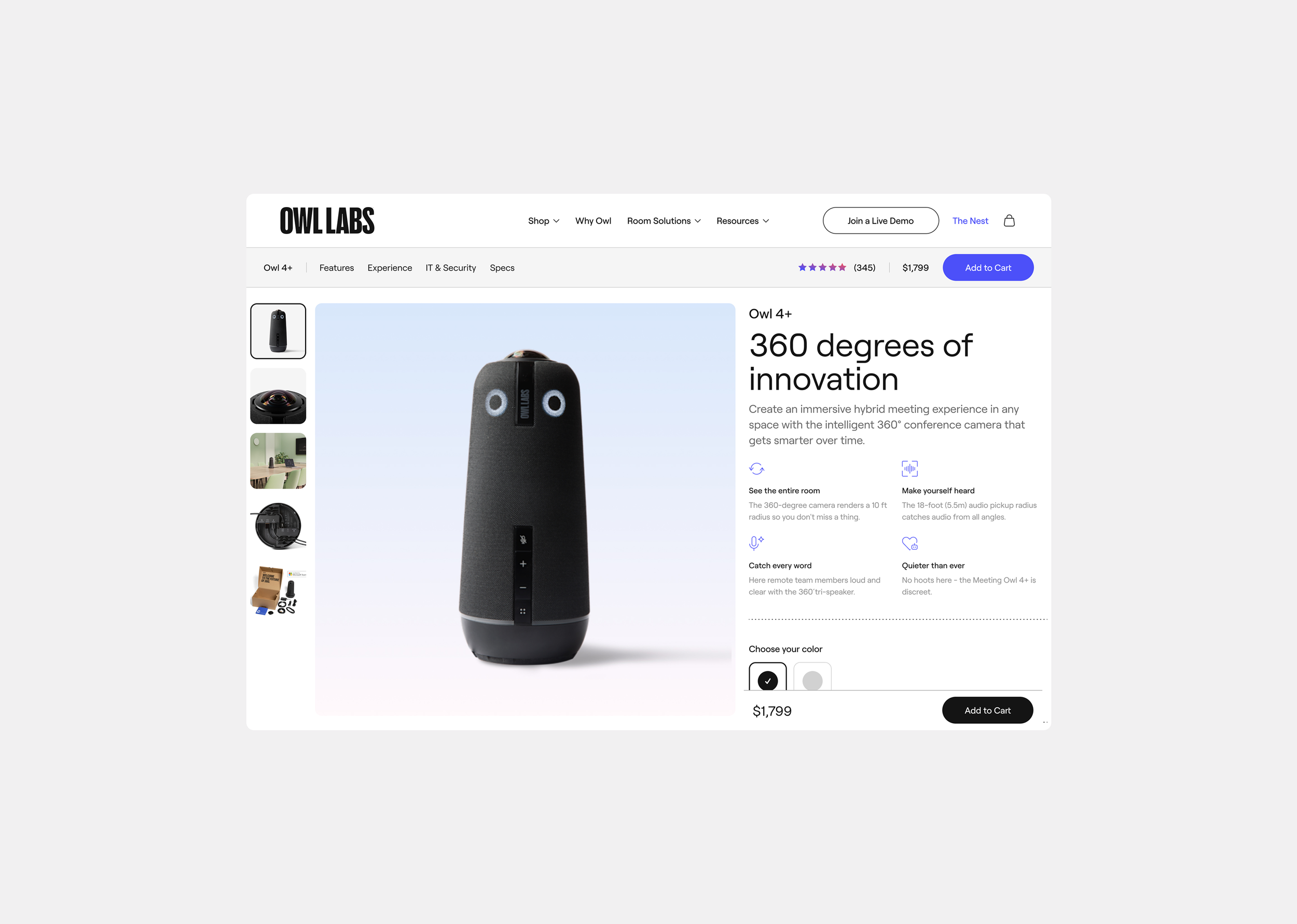
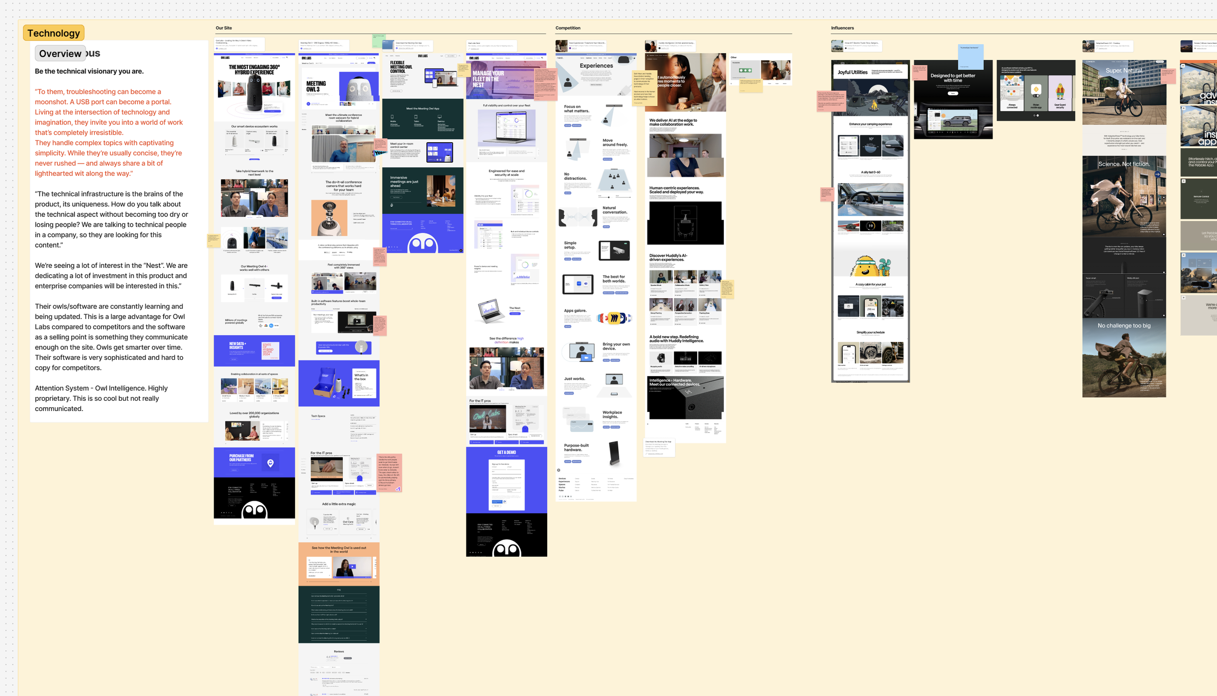
The site had been built and maintained in a way that made even simple updates painful for the internal team. Design assets lived across a tangle of disconnected Figma files. Campaigns, product launches, and site initiatives each had their own file, their own conventions, their own version of the truth. There was no shared source of truth for designers, content editors, developers, or leadership.
On top of the systemic issues, conversion on their product detail pages was suffering. On the PDP page, over 50% of users were dropping off below the fold. The ‘Buy Now’ CTA was the fifth-most clicked element on the page — buried behind a demo invite, a spec sheet link, and a video. Users were arriving at the page and immediately confronted with too many competing actions and not enough reason to stay.
When Owl Labs came to Third and Grove for managed services support, these were the problems underneath the problem.
My role
I was the lead designer on the engagement, working closely with our strategy team and collaborating directly with Owl Labs’ internal creative team, VP of Global Marketing, Senior Director of Brand, and Lead Designer throughout.
My responsibilities spanned the full design lifecycle: UX audit, creative workshops with the client, design direction and execution, Figma system architecture, design-to-dev handoff, and ongoing managed services design support.
Where we started
We began with a thorough discovery audit — reviewing the site’s UX, conversion data, brand expression, and Figma infrastructure. What became clear quickly wasn’t just that the PDP needed work. It was that the brand had a personality the site wasn’t letting through.
Owl Labs’ products are built around empathy — the belief that hybrid meetings should feel human on both sides of the camera. That warmth, that people-first thinking, was alive in their brand guidelines and completely absent from their web experience. Making that come through became a guiding creative principle for everything we designed.
We were about three-quarters through the discovery process when the client’s budget situation shifted. Leadership needed to see conversion impact fast — specifically on the PDP for their new Owl 5+ launch. We pivoted.
The Hero
The original hero buried the purchase path. We redesigned it around a clear conversion hierarchy: product imagery with real presence, a tight set of quick-hit features, social proof upfront, and a sticky ‘Add to Cart’ CTA that follows the user down the page. One primary action, always visible, never competing.
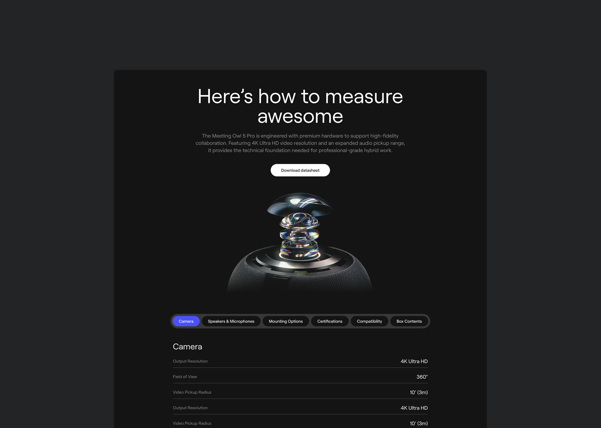
Consolidated Tech Specs
The existing pages split technical information across multiple sections, frustrating the IT buyers who needed it most. We consolidated everything — specs, certifications, compatibility, what’s in the box — into a single, well-organized section that served both the IT professional doing due diligence and the general consumer who just wanted to know if it worked with Zoom.
The Value Proposition
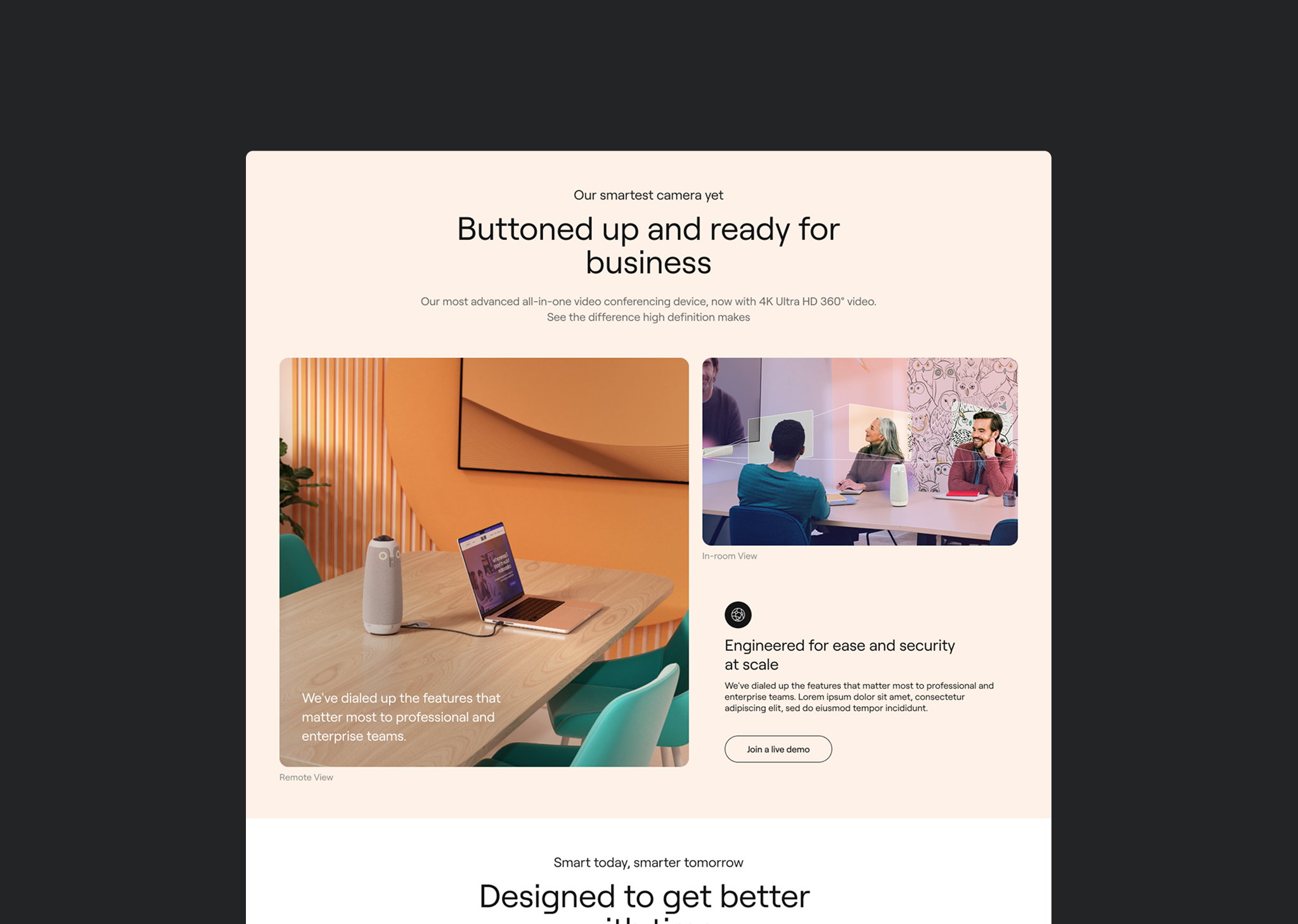
Owl’s 360-degree immersive view is a genuine differentiator — no competitor can replicate it. The existing comparison feature on the Owl 4+ page was already proving this: hundreds of clicks on the Remote View and In-Room View toggles showed users actively wanted to understand this. We made that experience a central feature of the redesigned PDP, leading with it below the fold to stop the drop-off.
Cross-Sell and Accessories
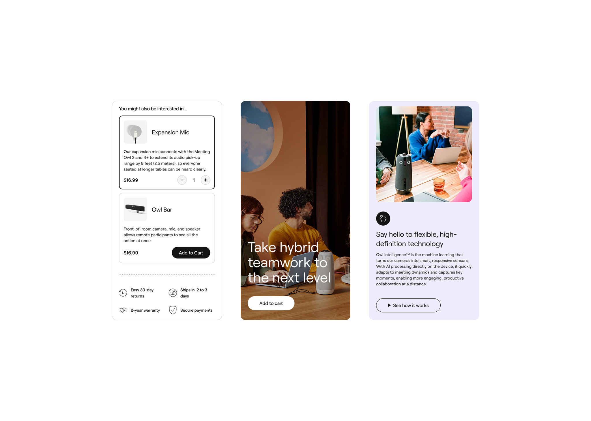
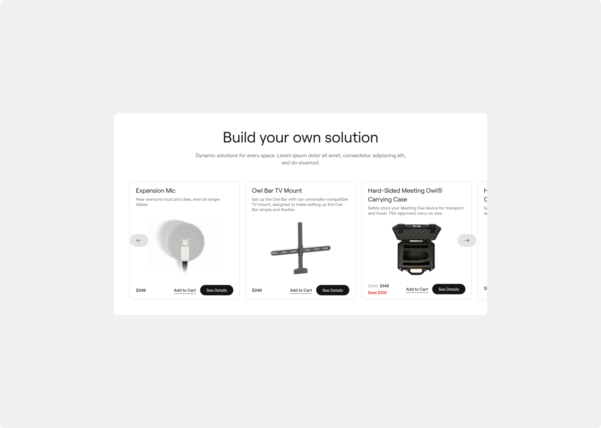
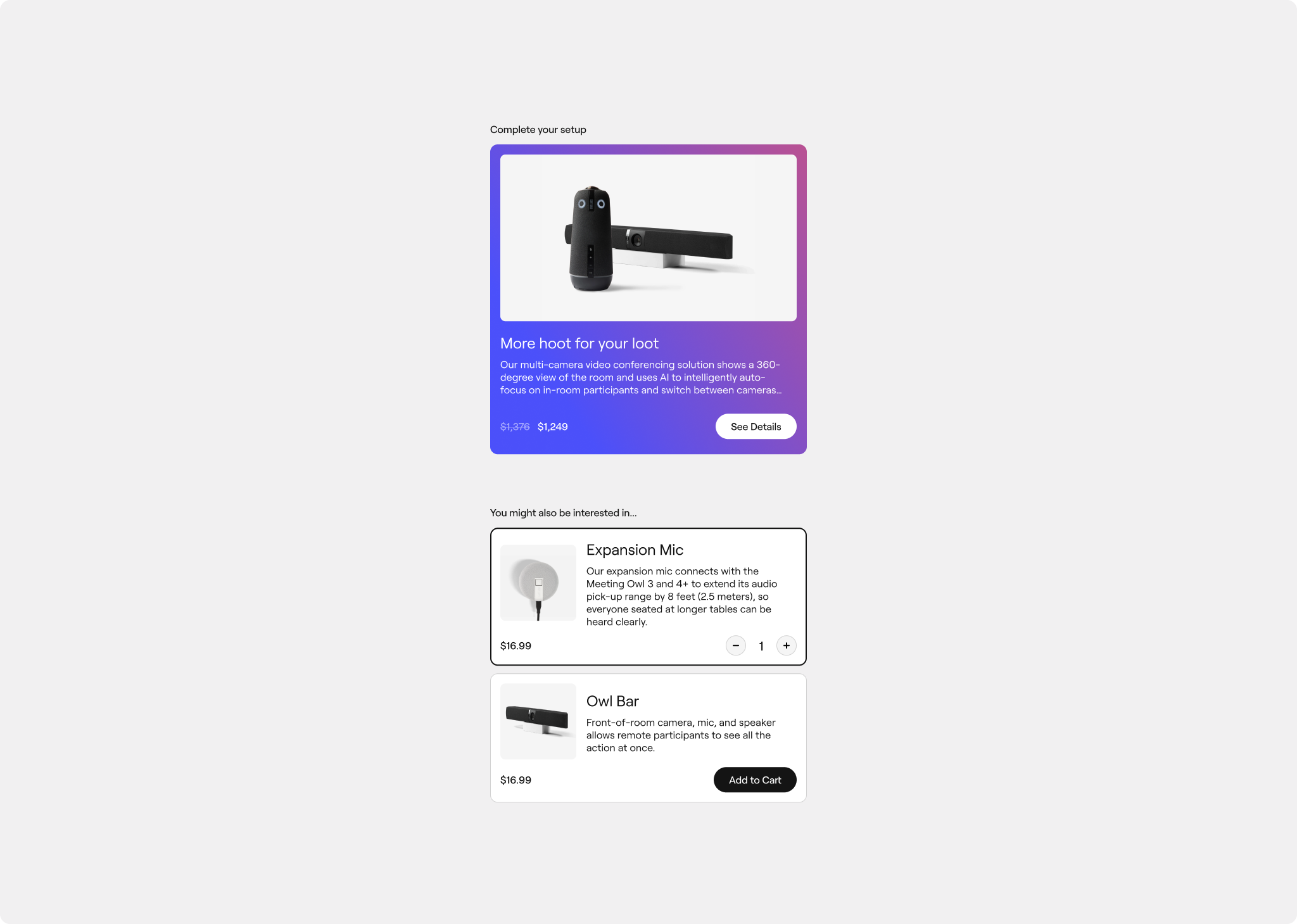
Users were already showing interest in accessories and add-ons. We designed dynamic cross-sell sections that surfaced the right products at the right moment — bundles, expansion mics, mounts — to increase average order value without feeling like a hard sell.
A Flexible Component System
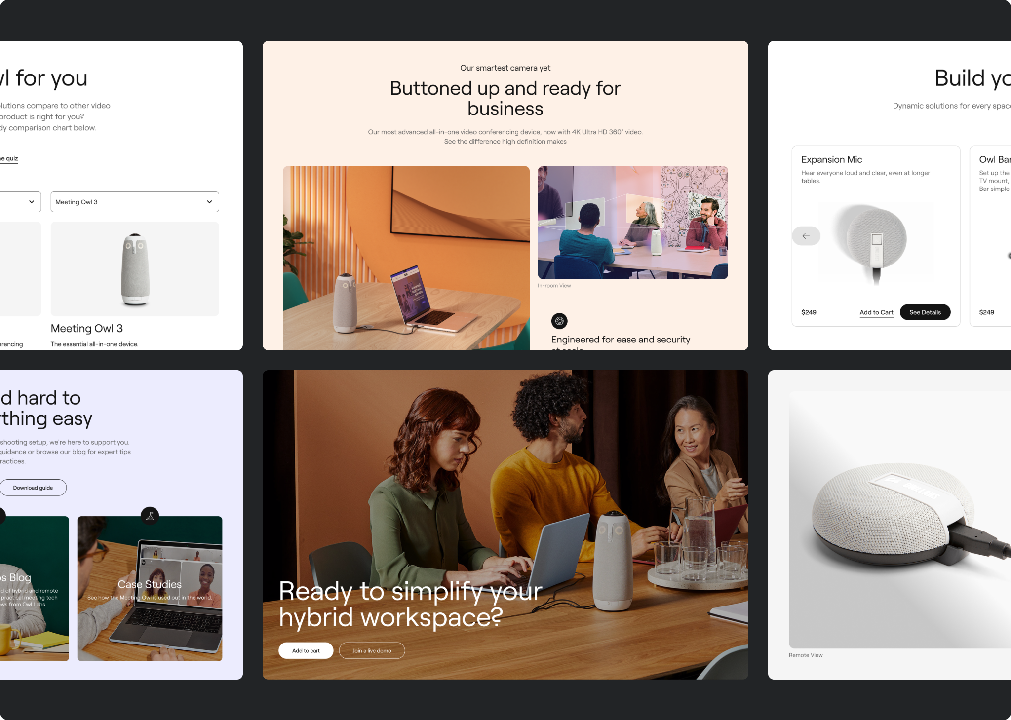
Rather than designing a one-off page for the Owl 5+, I built six new flexible, repeatable components that could be adapted per product — features and integrations, compatibility storytelling, tech specs, cross-sell, support, and social proof. Each component was designed to tell a different part of the product story depending on what that product needed. Scalable by design, not by accident.
The Figma library
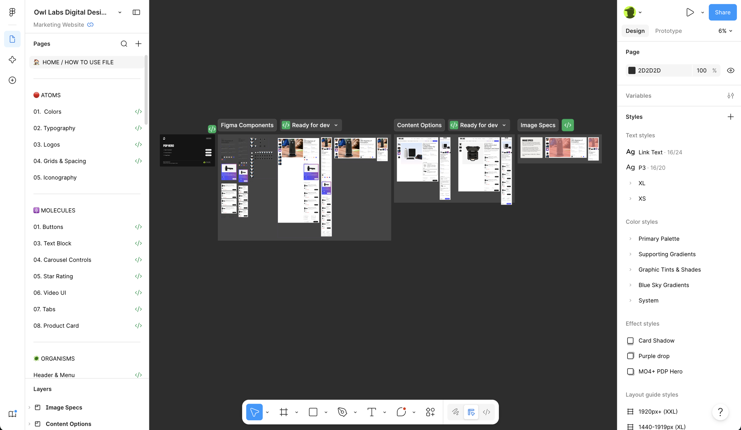
One of the most lasting contributions of this engagement wasn’t on the live site — it was the unified Figma library we built alongside the design work.
Owl Labs’ internal team had been working from scattered, disconnected files for years. Different campaigns, different conventions, different components that only half-matched each other. There was no way for a content editor, a developer, and a designer to look at the same file and understand the same thing.
I built a single source of truth: one Figma library containing all approved components, design styles, and brand standards — structured so that designers, content editors, developers, and leadership could all use it. The content team could use it to prototype new page layouts, write copy in context, and identify photography needs — all before a designer touched it. The design system was organized to scale with Owl Labs’ product line and evolving site needs, not just their current moment.
Beyond the launch
The PDP shipped. The partnership continued.
As Owl Labs has sent one-off requests through the managed services engagement, I’ve used each one as an opportunity to surface what we found in discovery — connecting individual asks back to the systemic issues we identified — and proposing solutions that solve multiple problems at once rather than patch one thing and create another.
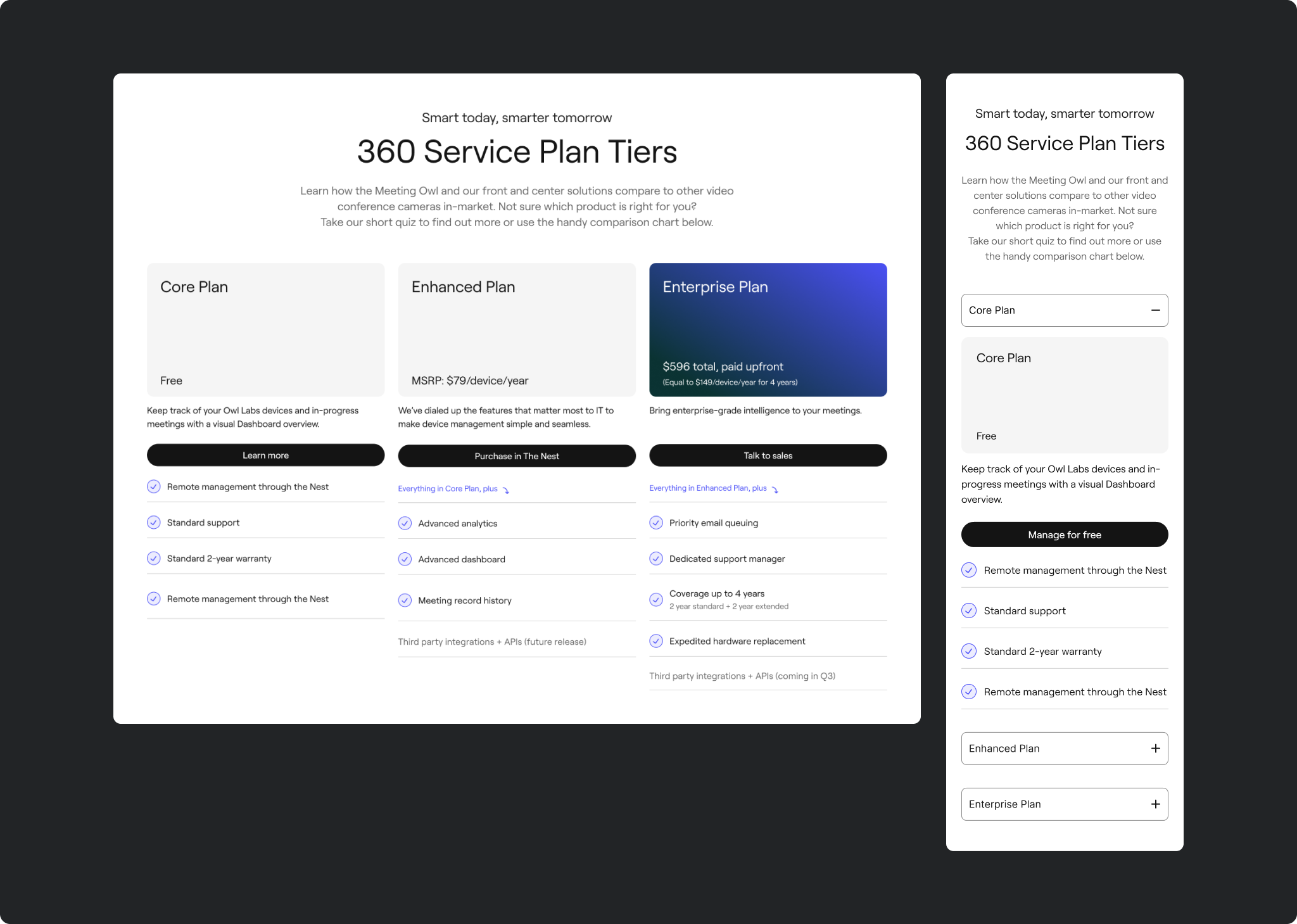
That approach has led to additional work I’m proud of: a new product launch strategy, and a Comparison component that lets users clearly understand the key differences between each product in the Owl Labs line — a direct response to the data showing users actively sought that information but couldn’t find it clearly presented.
The client went from needing us to move fast to trusting us to think ahead. That’s the relationship we were aiming for from the start.
Owl Labs reminded me why I care about design systems as much as I care about design. A beautiful PDP is a win for a quarter. A Figma library that empowers a content team to work independently, consistently, and confidently — that’s a win that compounds.
It also reminded me that the best thing you can do when a client asks for one thing is understand what they actually need — and design for that instead.
Some kind words
-
“Big dawgz to the big dawg himself, Thomas, for leading a super productive and collaborative session with our Owl Labs clients this morning. These sessions make our clients feel so involved in the design process and strengthen our partnership.”
-
"Huge kudos to Thomas on the PDP creative brief and design review presentation for Owl Labs — well received, and Owl is so excited to get into development to level up their PDP pages. Great job pushing the envelope and showing the client your madd skillzz.”"
-
"Thank you for your tireless effort and grit — starting and stopping discovery, strategizing, designing, building and testing the new PDP, and beginning go-to-market planning for their new product.”