
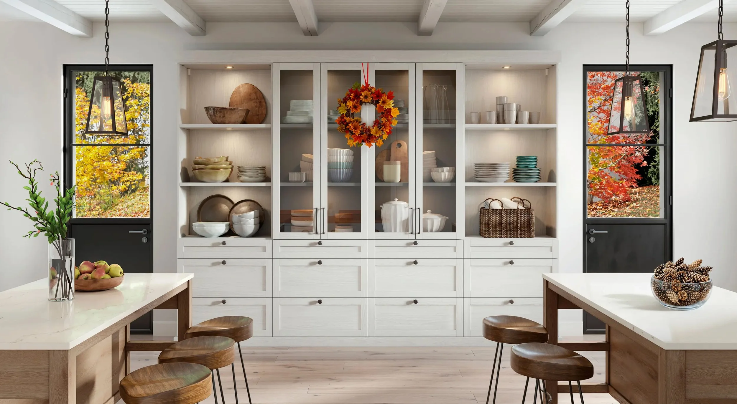
California Closets’ website was visually elegant — the product of a significant investment in design. But when Third and Grove converted from build partner to ongoing support, I quickly identified what the original agency had left behind: a site with strong aesthetics and almost no user thinking underneath them.
My first task was auditing the Room and Solution detail pages. What I found set the tone for everything that followed.
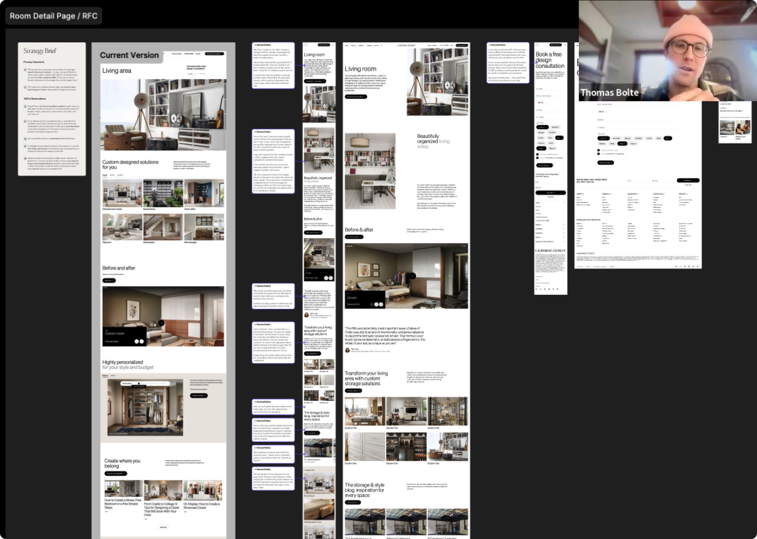
The very first thing users encountered on highly informational pages was a consultation request form — before they’d seen a single reason to trust the brand. The “before and after” budget section meant to educate buyers was showing reach-in closet examples on the Living Room page. SEO content was nearly absent. Responsive layouts were inconsistent across components, creating both a frustrating experience and accessibility failures. And there was almost no social proof anywhere on the page.
The site looked confident. It just didn’t think about its users.
Phase 1: Targeted Fixes, Maximum Restraint
Rather than proposing a redesign, I worked within the existing system — modifying components rather than replacing them, moving fast to earn trust.
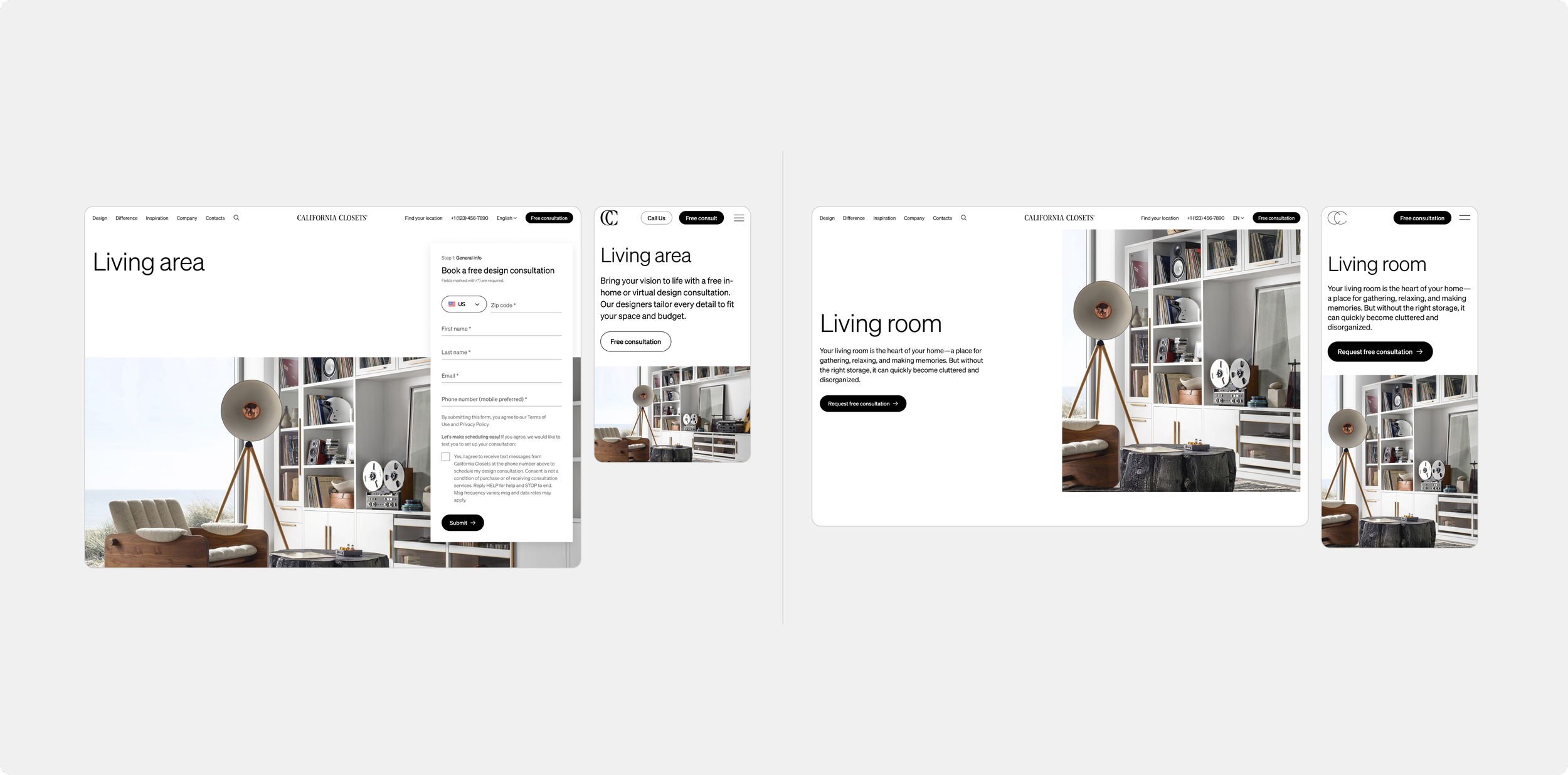
We relocated the consultation form out of the hero and replaced it with a clear CTA button. We added contextual text to the hero and intro sections for both user clarity and SEO value. We introduced an optional testimonial component to build social proof. We restructured the primary CTA hierarchy to create clearer moments of conversion.
Small interventions. Real improvement. The client noticed.
The Audit Grows
Once the client saw how quickly I could identify and articulate problems, they gave me broader access. A full site audit revealed a consistent pattern:
-
Typography
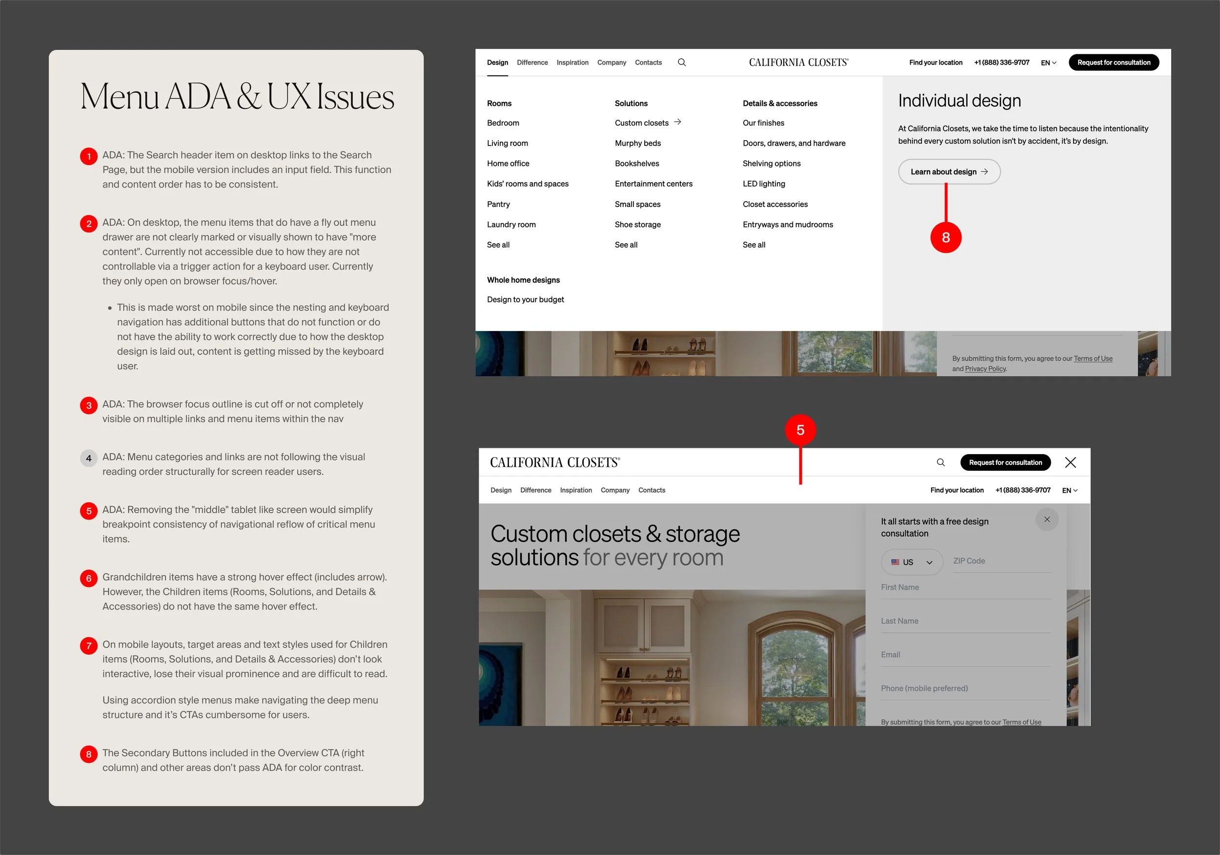
Text styles weren’t scaling consistently across breakpoints, creating visual inconsistency throughout the site.
-
Grid Alignment
Component grids were misaligned across multiple templates, creating a subtly broken feel at scale.
-
Content Order
Desktop-to-mobile content reordering was inconsistent, creating UX accessibility issues.
-
Navigation
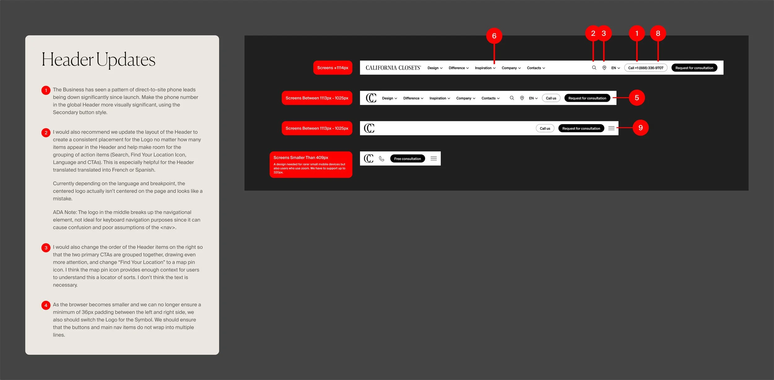
The responsive header had overlapping nav items at mid-range screen sizes. The centered logo created visual instability on smaller screens. The mobile menu made it difficult for users to reach key landing pages.
Phase 2: Significant Initiatives
-
Request for Consultation
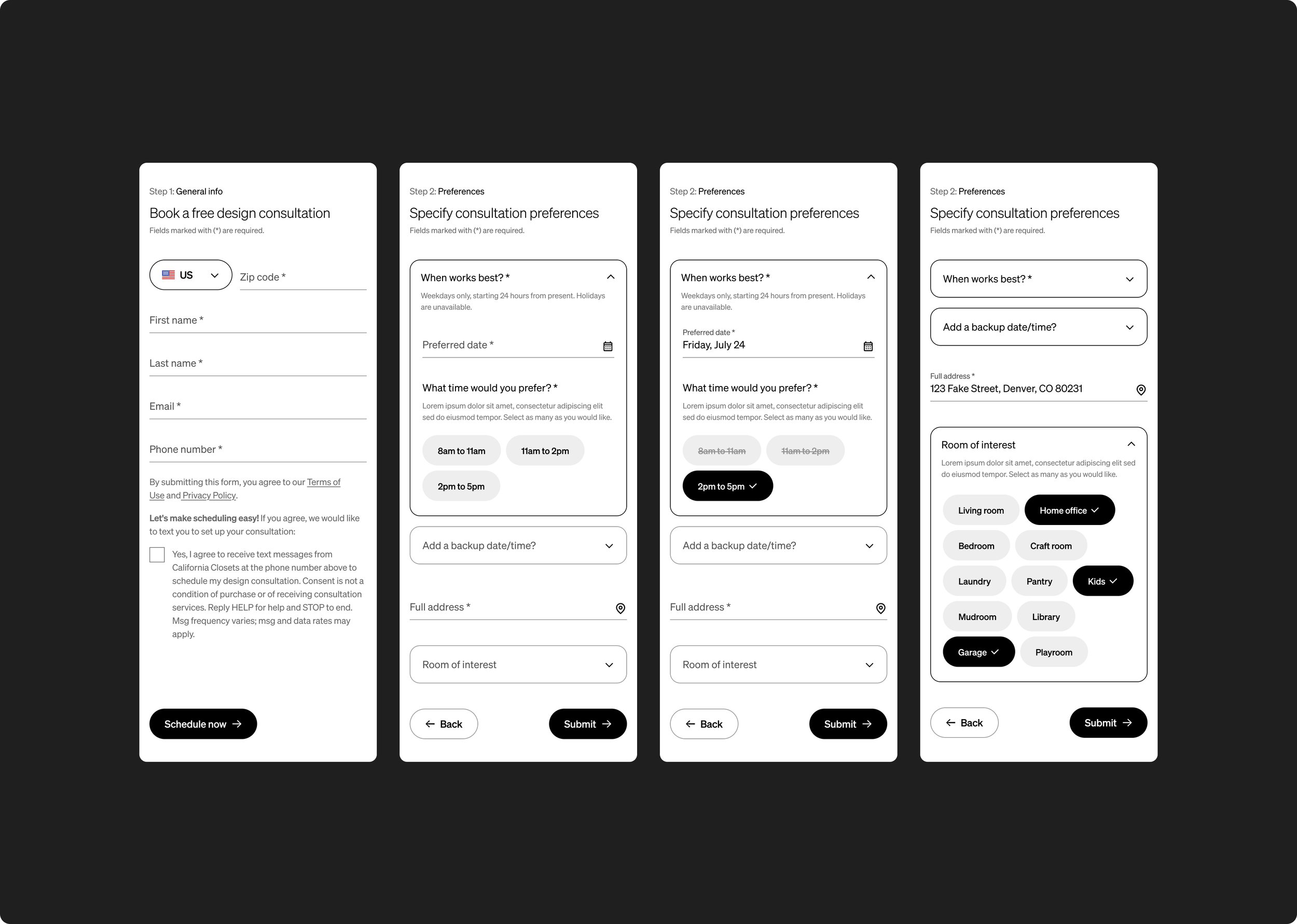
The RFC form is California Closets’ single most important conversion point. I redesigned it across both the hero component and the dedicated /request-consultation page — integrating a new online consultation scheduler, adding address validation flow, improving accessible form states, and streamlining the overall experience for users filling out what is a genuinely important form.
-
Mobile Navigation Overhaul
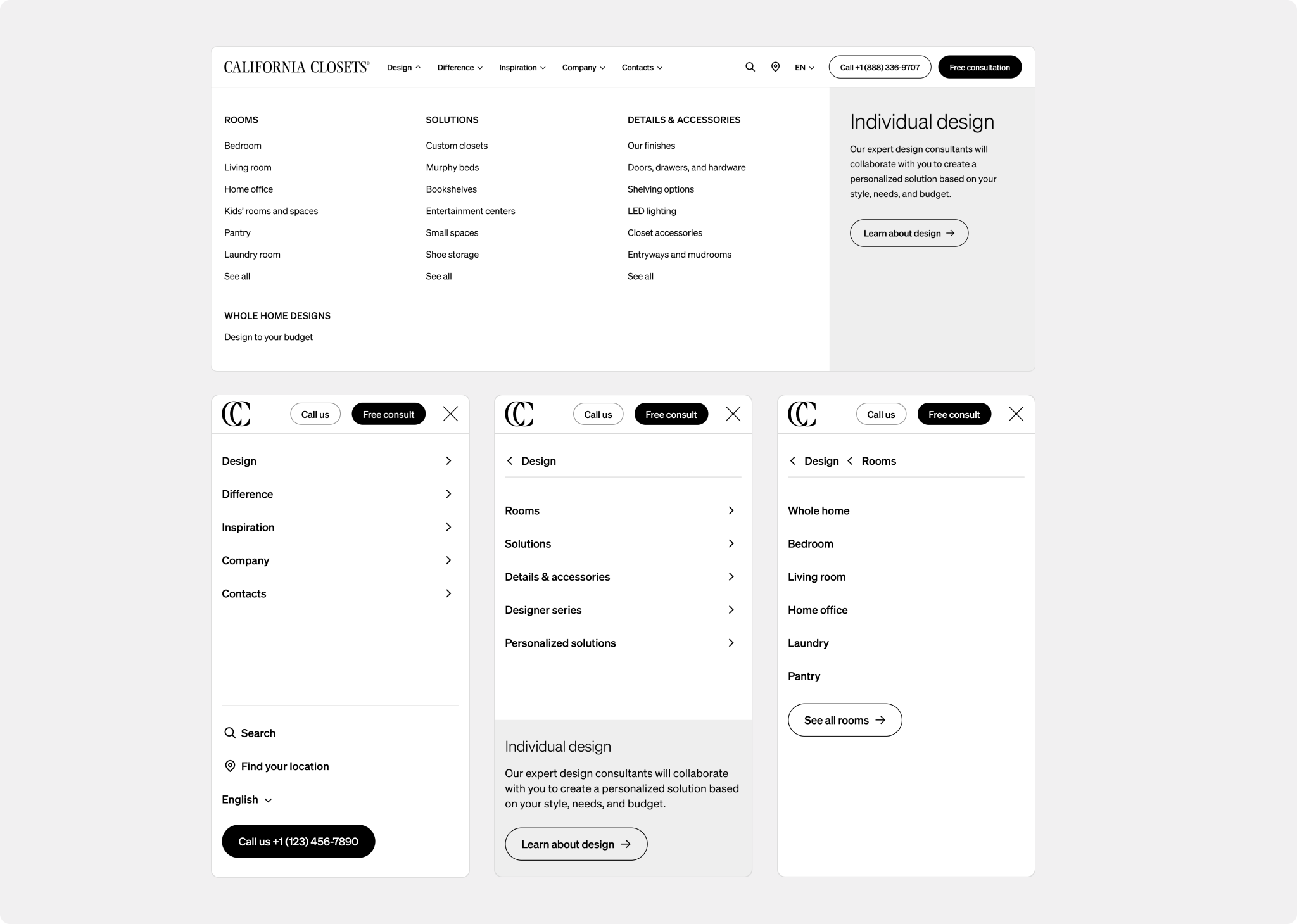
I redesigned the mobile menu into a proper multi-level navigation — giving users a clear, accessible path to the brand’s extensive product and room category structure without the confusion and dead ends of the original implementation.
-
New Components
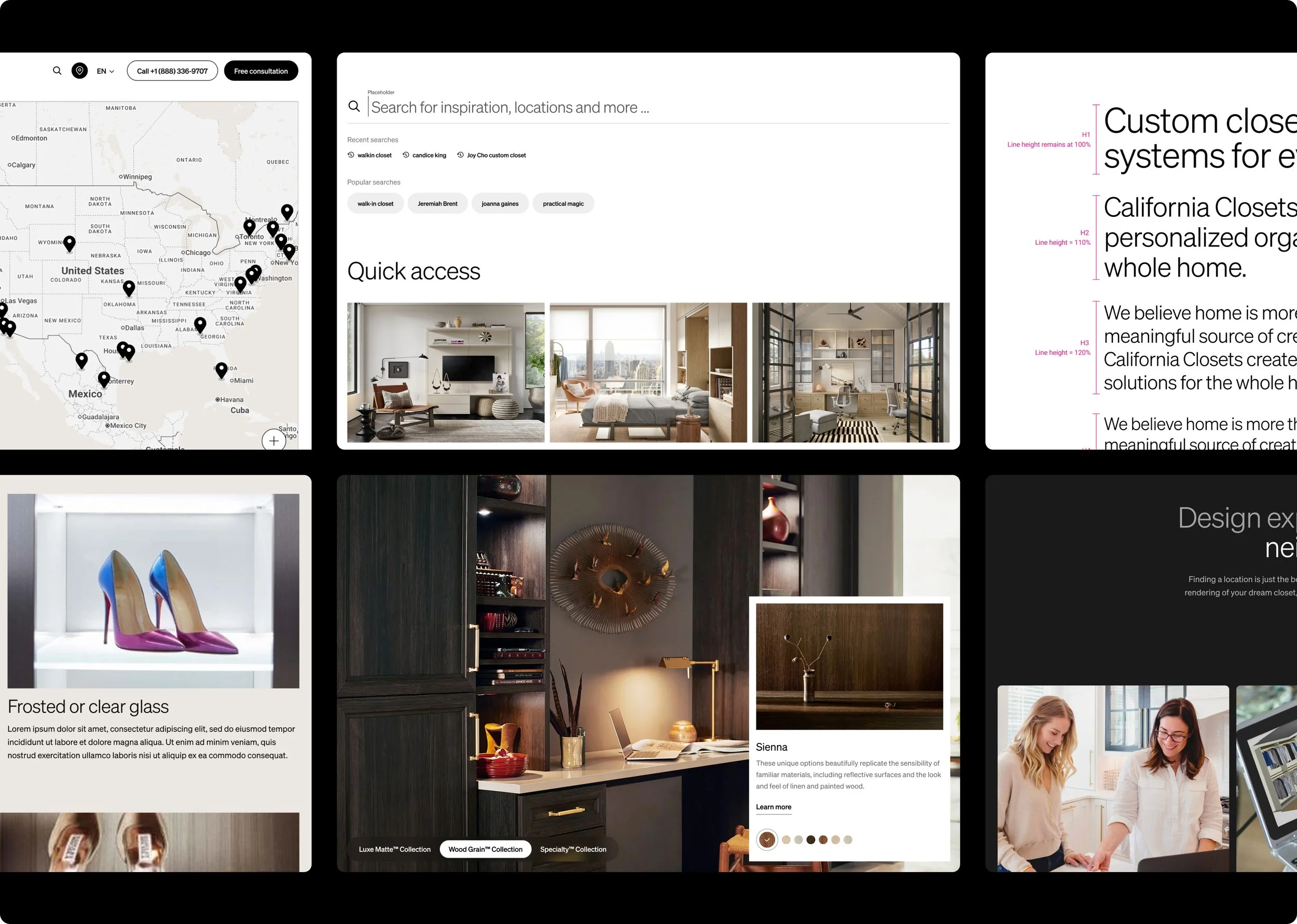
I designed and built out a Masonry Grid and Card Grid component to expand the site’s visual toolkit — giving the content team more flexible ways to present product inspiration and editorial content.
What’s Next
The deepest problem on the site is still unaddressed: California Closets has almost nothing to say about what it’s like to actually work with them. The site sells the product beautifully — custom closets, premium finishes, aspirational lifestyle imagery — but never communicates the experience. The consultative process, the employee-only installers, the design expertise, the “Practical Magic” brand promise — none of it comes through in the actual UX.
I’ve presented my brand messaging audit to the client team. The work to fix it is next.
Sometimes the most important thing you can do for a client is tell them what they don’t want to hear — clearly, specifically, and with a plan to fix it. California Closets had invested significantly in a beautiful site. Pointing out its strategic gaps required building trust first, and earning that trust required proving that my instincts were right with small, fast, well-reasoned interventions.
The work isn’t done. That’s the point.
Some kind words
-
"I wanted to let you know how much we appreciate Thomas. He's an individual that is very passionate about his work and this passion comes through in a warm and personable way when he interacts with others. He's great at translating feedback, giving guidance and coming up with creative solutions. His contributions have been a huge asset to the California Closets brand as a whole."
Danielle Olivari, Technical Product Manager, California Closets
-
"Shoutout to Thomas and Kelsey for designing the new Rooms, Solutions, and Details pages! These are essential to CC as they are at the core of their business strategy! We took something that didn't serve them from another agency and made something meaningful that supports their business. Super proud of this team!"
Khadijah Khan, Project Manager
-
"We just had a fun Lunch & Learn hosted by TAG for California Closets - we got to share some insights and best practices about UX for forms as a professional development and learning opportunity for their team. Shoutout to Thomas for jumping in with this presentation and always sharing his expertise in a friendly and approachable way."
Amy Rumbarger, Creative Director