

Littler is the largest global employment and labor law practice — 1,900+ attorneys, 100+ offices worldwide, and a suite of proprietary technology products that put real distance between them and every other firm in their space. Their positioning is built on ingenuity, people-first culture, and a relentless commitment to innovation in an industry not known for it.
What their digital presence communicated was something else entirely.
Design & Creative Direction. Amy Rumbarger and Thomas Bolte
Strategy. Eliana Doering
Development. Brandon Stumbo
Discovery
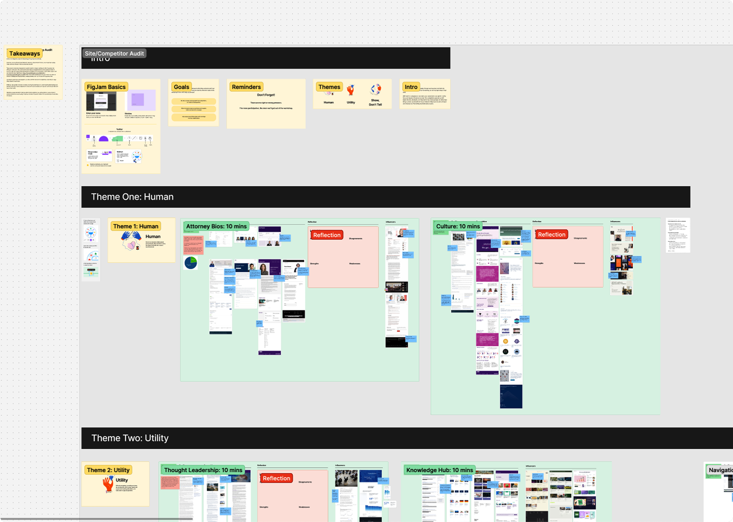
The engagement began the way the best ones do — with real listening. Brand workshops and discovery sessions dissected Littler’s three key pillars: their people, their insights, and their core practice areas. We examined how the firm saw itself, how its clients experienced it, and where competitors were pulling ahead. By the time we presented our findings, a working homepage concept and agreed-upon art direction were already in front of the client. The audit had done its job: the client had heard what wasn’t working, understood why, and was ready to move.
That momentum carried the entire year-long collaboration. A smaller, more focused stakeholder group gave the team real creative latitude — the kind that produces work you’re genuinely proud of, rather than work that survived a committee.
The Creative Concept
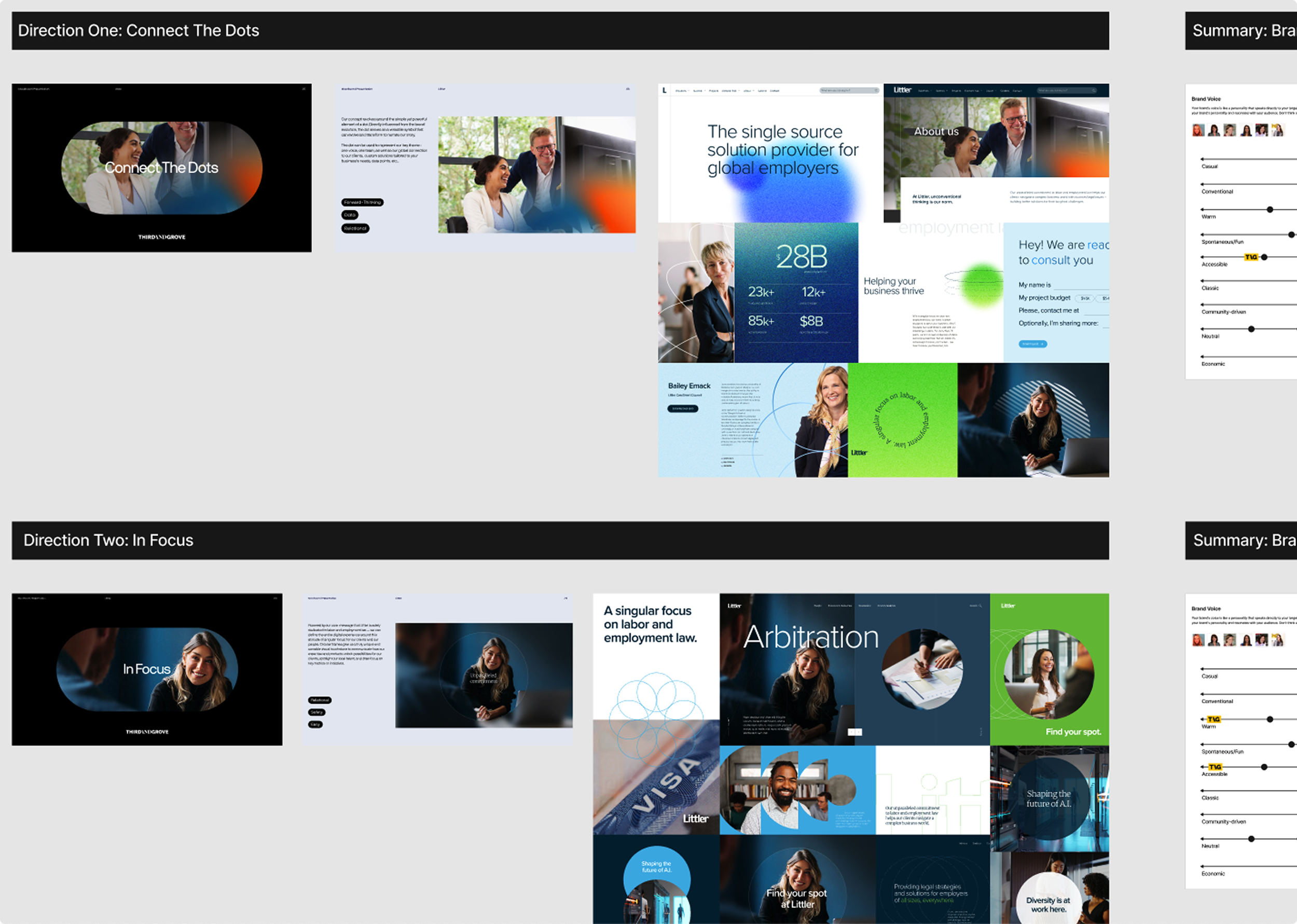
Littler serves employers, which means their clients are always thinking about people — the teams they lead, the cultures they build, the legal challenges those relationships create. That tension became the creative foundation: people and technology, side by side.
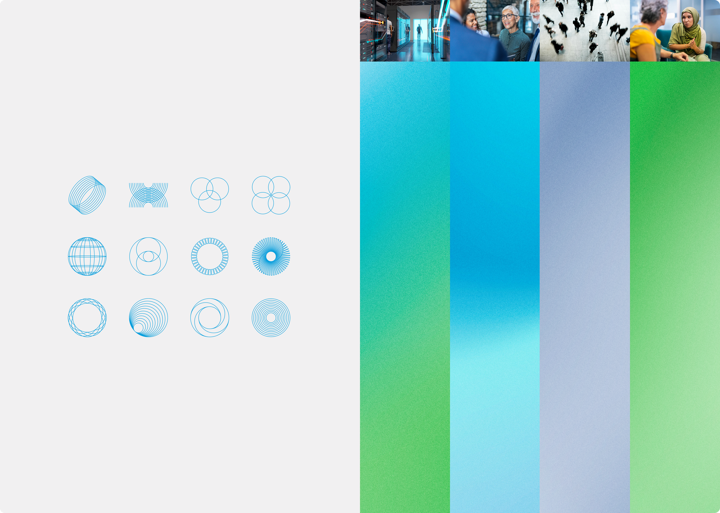
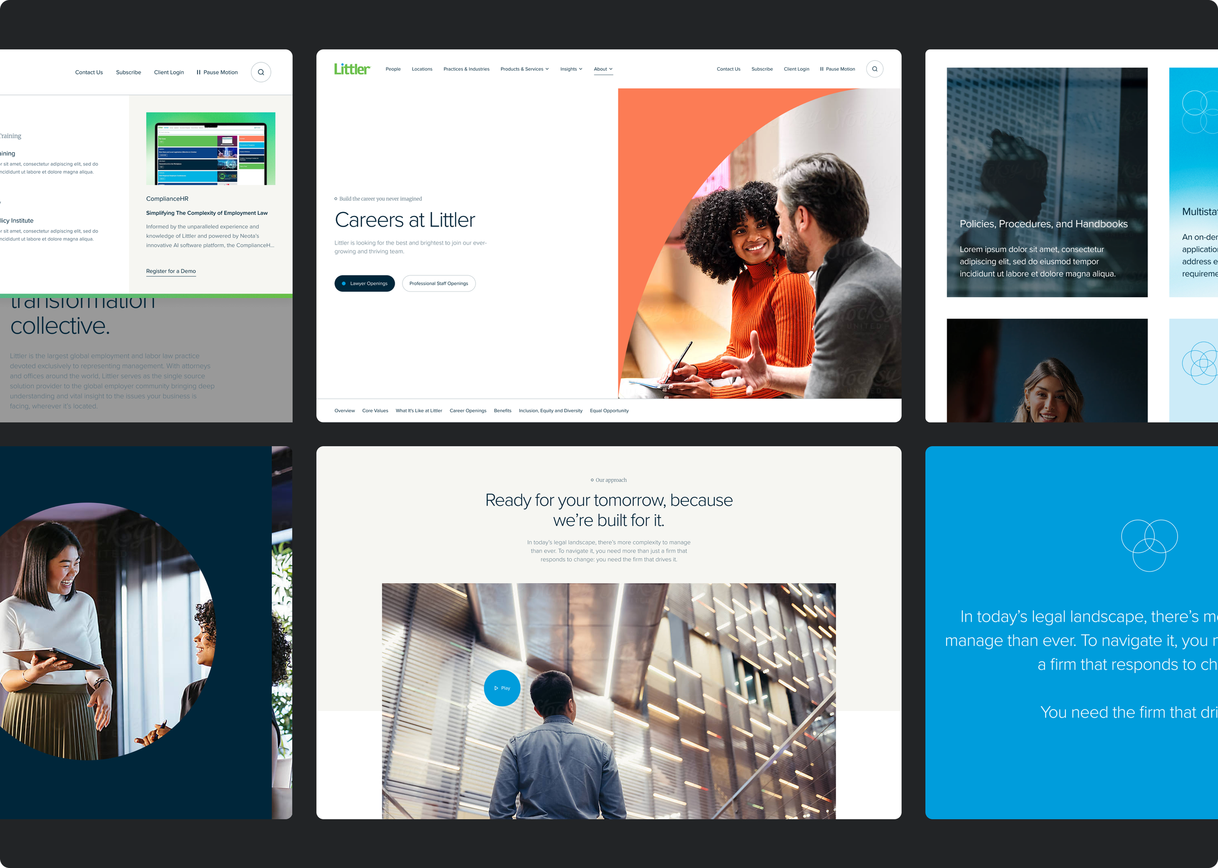
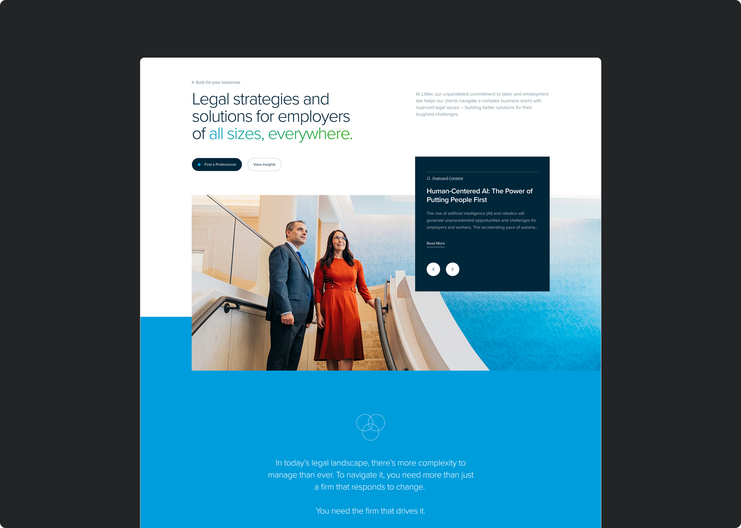
The visual language blends warm, authentic photography of real people with the sharp, segmented layouts and gradient treatments that signal Littler’s proprietary technology and forward-thinking approach. The result is a site that feels approachable and authoritative at the same time — human enough for a relationship-driven business, modern enough for a firm that genuinely leads on innovation.
The Dot
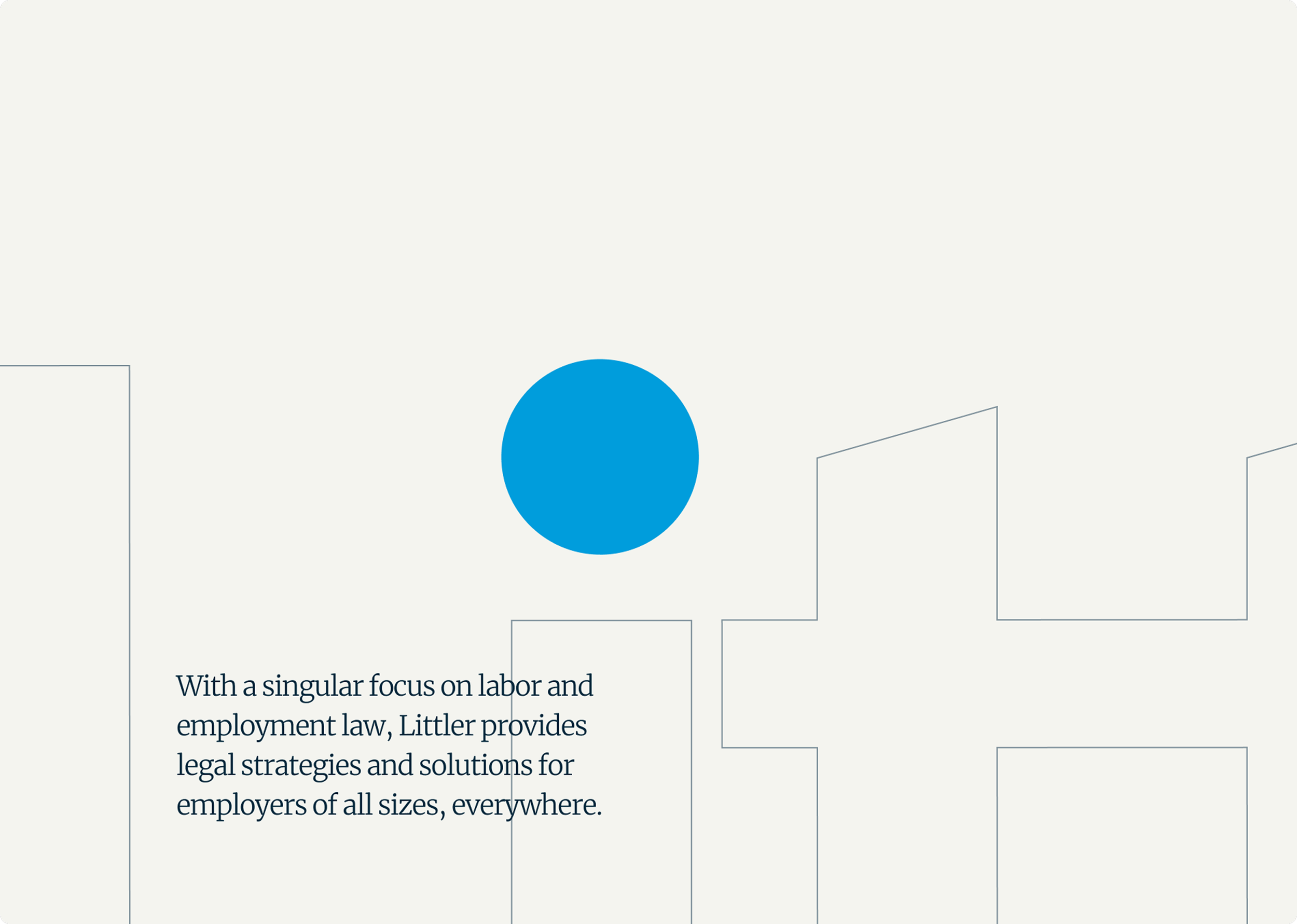
Littler had a brand concept they didn’t know what to do with: the dot. It had lived as an abstract concept, derived from the logo, quiet and underused. We gave it a purpose.
As you scroll, the eye of the dot in the logo becomes a persistent mark — appearing in the insights component, emerging from buttons on interaction, and anchoring the primary CTA, which we widened and gave curvature to draw the eye. A detail that was invisible became a through-line, one of those quiet decisions that makes a brand feel considered without anyone being able to say exactly why.


Motion
Animation wasn’t a nice-to-have — it was a client requirement, and it required real care. Littler’s audience skews older and less constantly online, which meant motion had to be handled with discipline: predictable content reveals, legible text, no gratuitous movement. But pushed deliberately on the moments that matter. The primary CTA is where the site earns attention, and that’s where the motion does its heaviest lifting — drawing focus through movement that feels intentional, not decorative.
The System
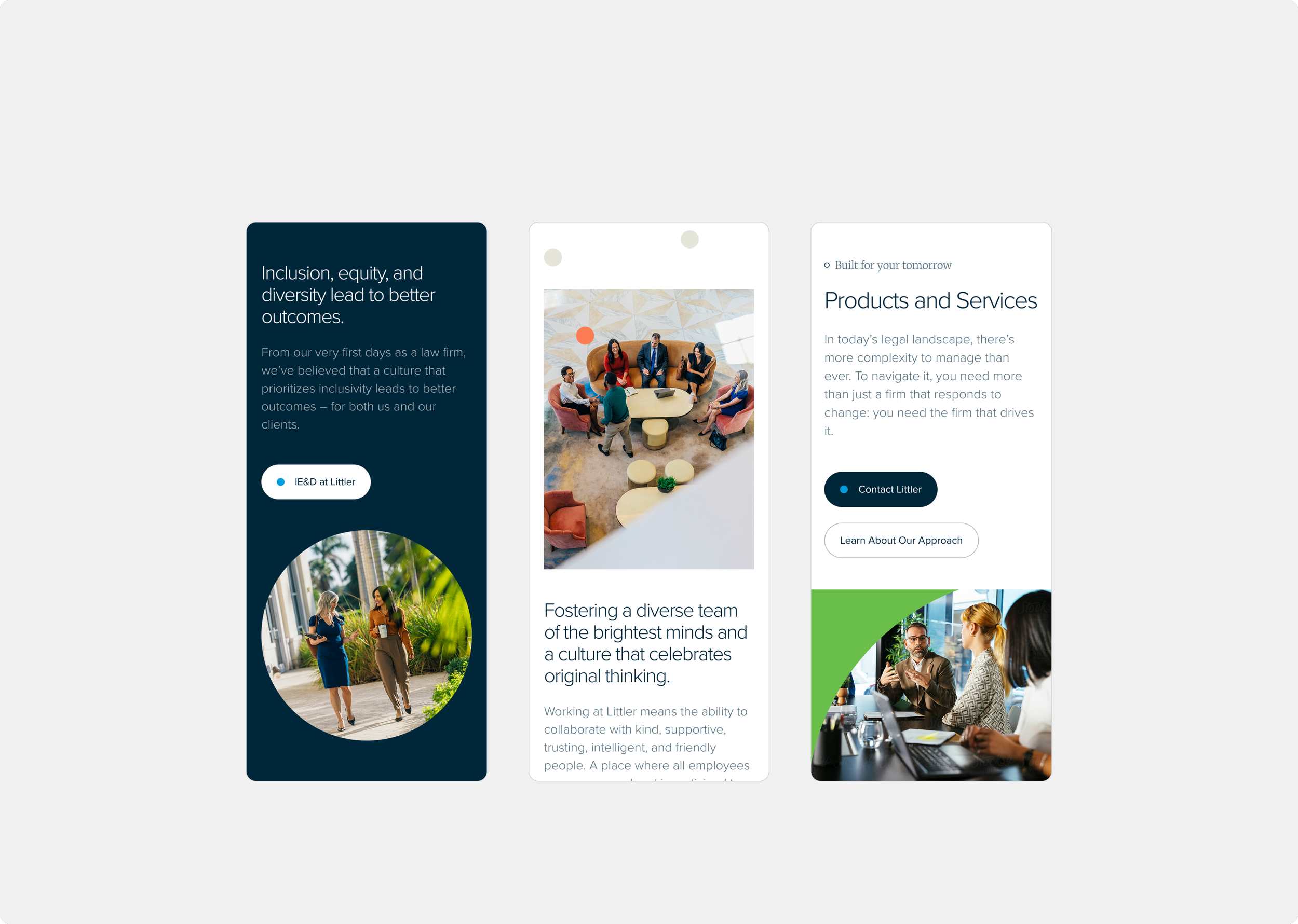
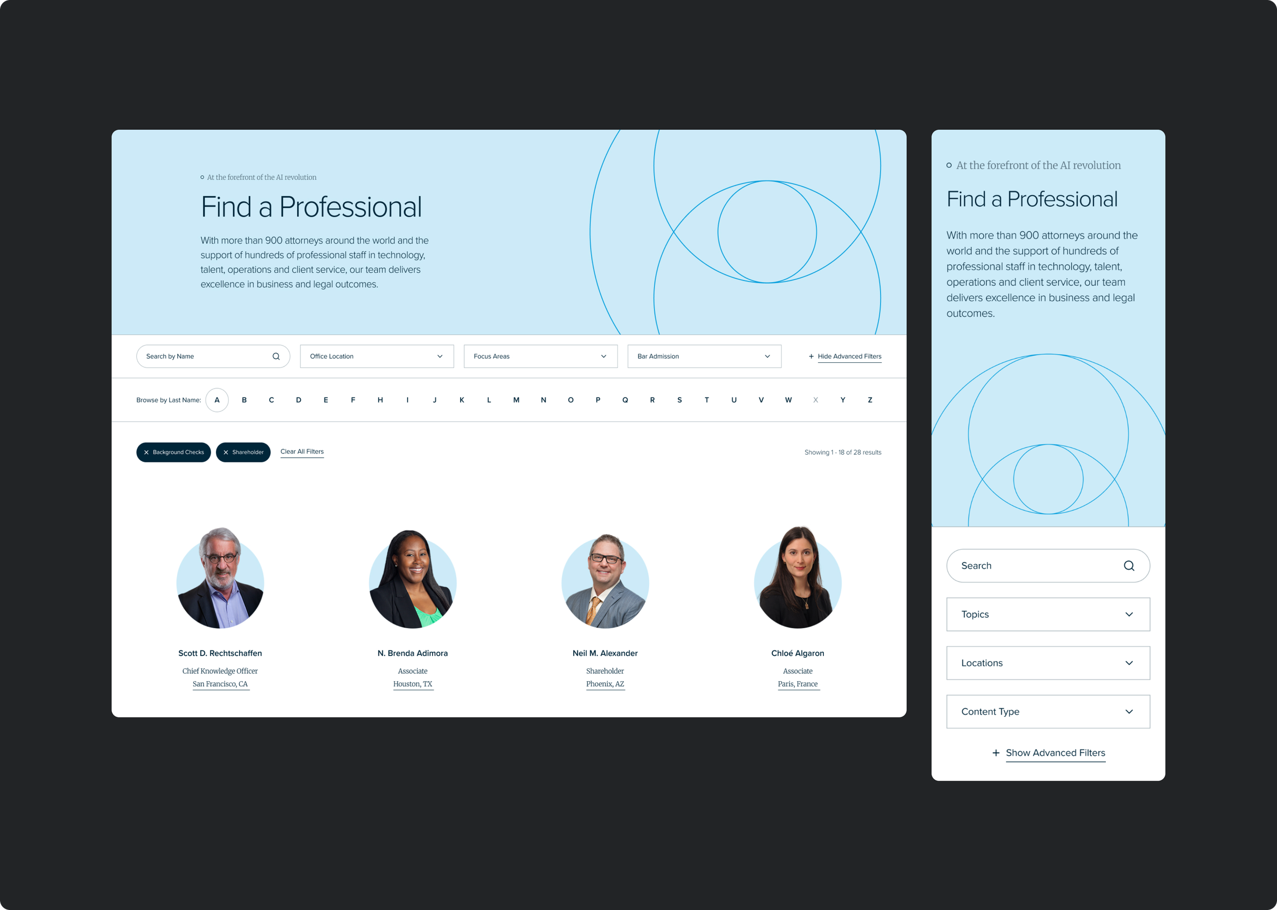
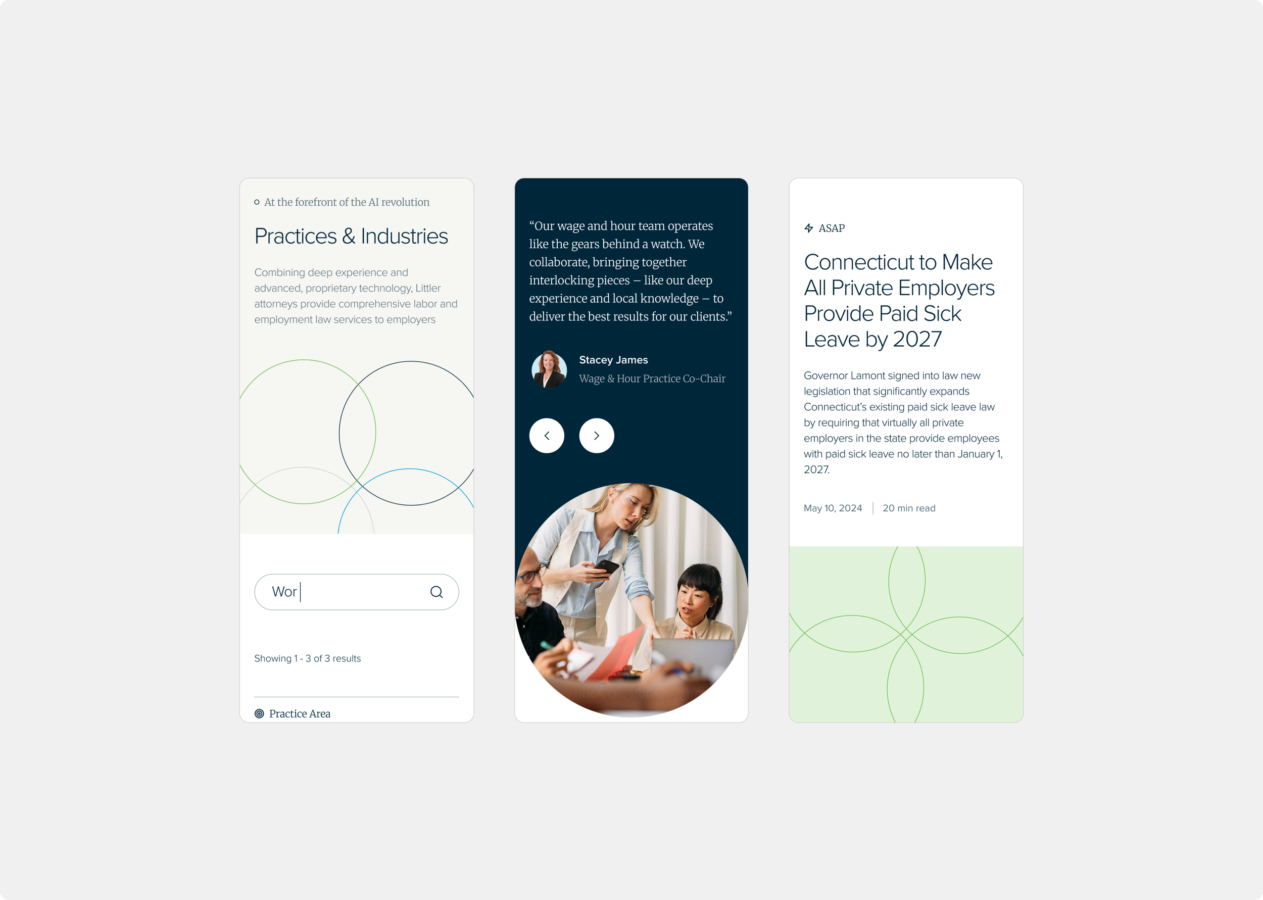
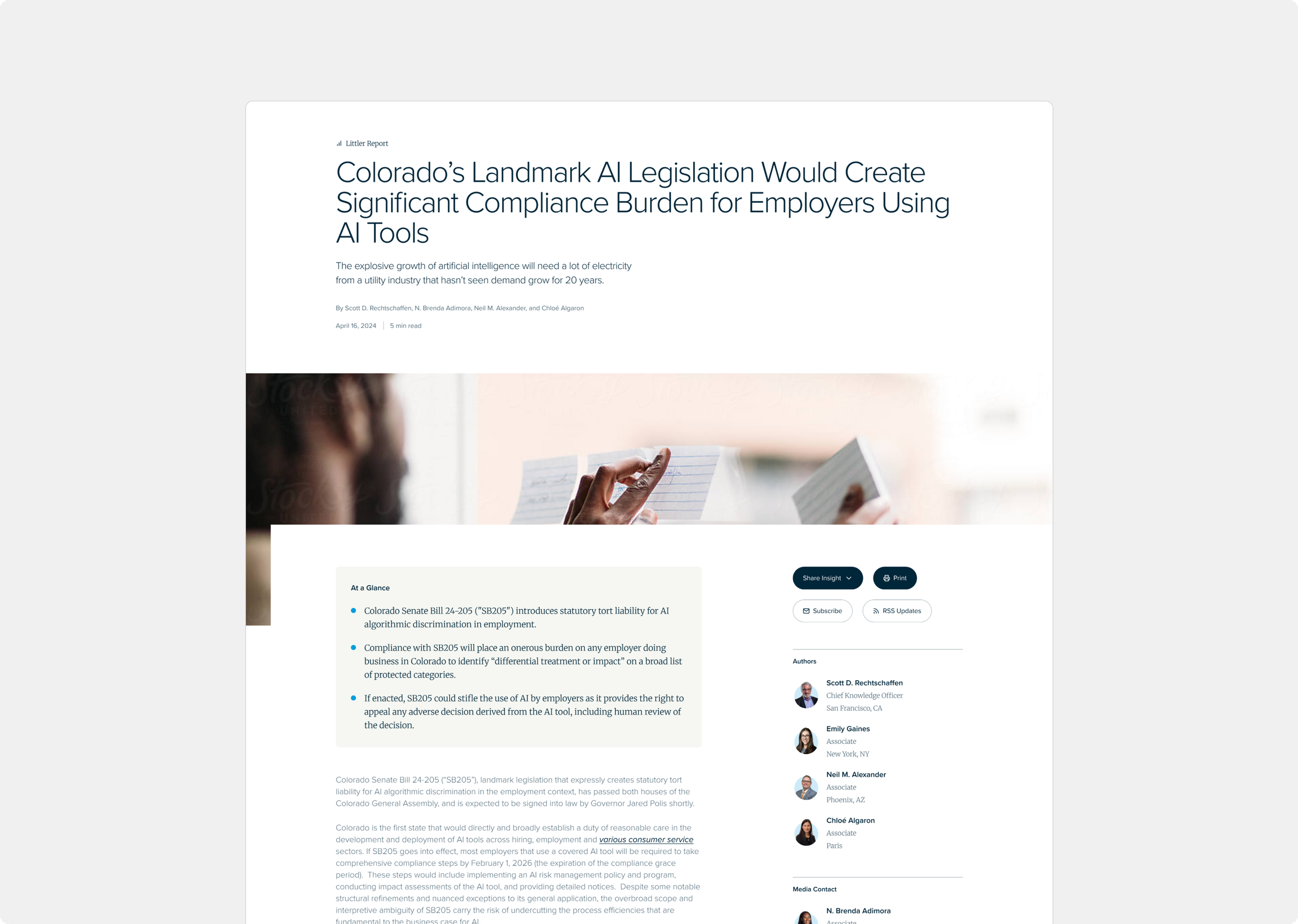
The design system was built for scale from the start — approximately 13 page templates and 20 components, focused on the three areas where Littler’s differentiation is clearest: insights, people, and services. Littler’s content library is enormous, so surfacing expertise was critical. The insights hub makes their depth of knowledge navigable and visually credible. The attorney bio pages do something most law firm sites don’t — they treat attorneys as individuals worth knowing, not entries in a directory, showcasing expertise, certifications, and published books alongside their practice areas.
Proof is in the pudding
-
+286%
average session duration
-
+27%
pages per session
-
-53%
bounce rate

“TAG kept us on track throughout the project ensuring discovery, documentation, and development went smoothly.”
— Director of Corporate Marketing & Brand Strategy