
For more than a century, Cummins had taken on the world’s toughest power challenges. Their challenge was changing: finding new ways to power essential industries that worked economically and logistically realistic. Ways that were better for the environment and communities they serve.
Cummins had the know-how and a viable plan.Their digital presence was to be the rallying cry.
Design & Creative Direction. Thomas Bolte
Strategy. Eliana Doering
Development. Justin Cornell
The challenge
The relationship with Third and Grove started small: a discovery audit and digital roadmap focused on SEO health, navigation architecture, and technical performance. Cummins’ organic search traffic was strong, but the vast majority of it was riding on brand-name recognition alone — not topical authority. The site’s navigation had grown into what one stakeholder later called a “Winchester Mystery House” — sprawling, inconsistent, and difficult for both users and Cummins’ own internal teams to maintain.
Over the next several years, that initial engagement grew into one of the most significant accounts I worked on — spanning technical optimization, a full brand transformation, an acquisition integration, and a sister-site launch.
My role
I was the lead designer across the full multi-year Cummins relationship — from the original 2022 discovery audit through the 2024 brand refresh and the Meritor/JVS Brakes acquisition migration. My responsibilities included UX strategy and design, component system architecture, brand system translation, direct collaboration with Cummins’ Creative Director and stakeholders, and ongoing design leadership as the account scaled.
How the relationship grew
Trust compounds. We earned it early with Cummins’ Digital Experience Leader by proving our expertise across SEO, strategy, design, and development — and by running a genuinely collaborative process where the Cummins team felt like they were part of every decision, not just recipients of one. We leaned on their deep industry knowledge rather than assuming we knew their business better than they did.
That trust translated into scope. Over roughly two years, we moved from a focused technical and SEO audit into being entrusted with Cummins’ full digital brand transformation — and eventually, a brand-new sister site built from the ground up.
Phase 1 — Foundation: Discovery, SEO & Navigation
-
Navigation Architecture
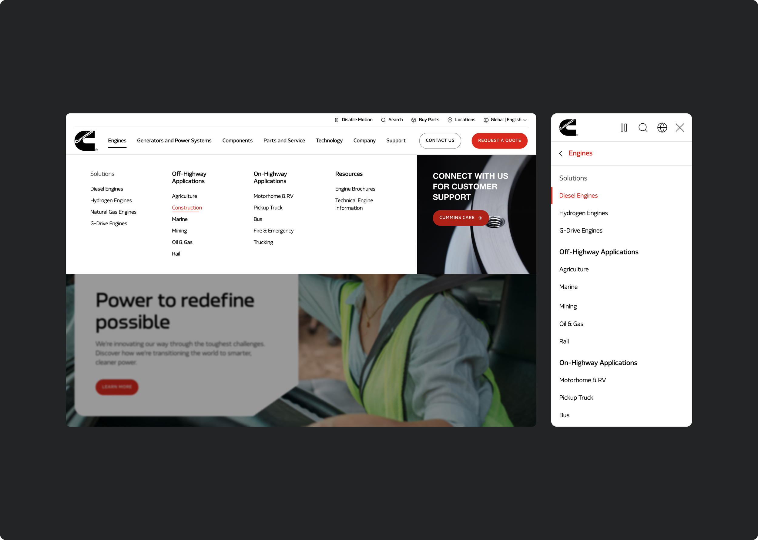
The existing navigation suffered from cognitive overload — redundant pages, inconsistent URL structures, and no clear hierarchy guiding users toward what they actually needed. I led the redesign of a streamlined main and sub-navigation system, designed to feel as dependable and precise as the products themselves: smooth transitions, consistent patterns, and a flexible sub-nav that scaled from a dense “Products” menu down to a minimal “Careers” menu without feeling broken or inconsistent.
-
Product Finder Overhaul
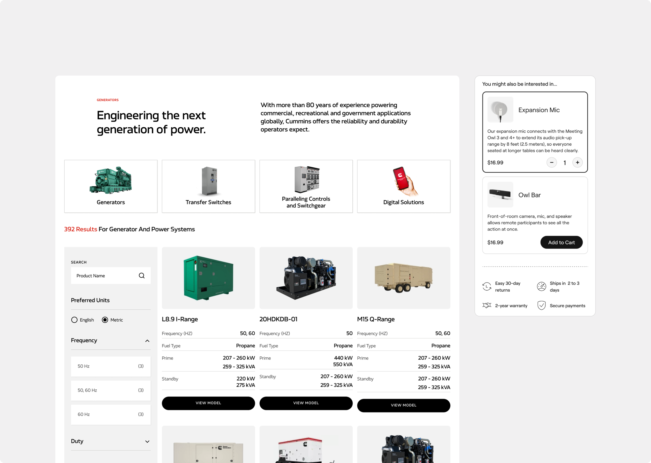
Customers trying to find the right product — by industry standard, technical spec, or application — were hitting dead ends in a slow, cumbersome filtering experience. Competitors weren’t doing anything revolutionary, but they were doing the basics well. I led an extensive redesign of the filtering UI/UX: eliminating dead-end filter paths, surfacing how many relevant products existed per filter selection before a user committed to it, streamlining the mobile experience, and making high-level product scanning fast and clear.
-
Quote Request Conversion
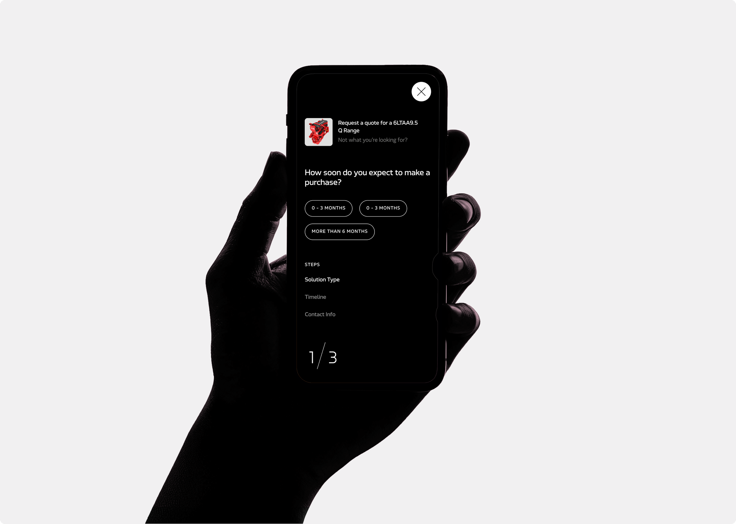
The “Request a Quote” CTA — present throughout the site — was a static, generic form. I redesigned it into a dynamic, quiz-like flow that felt faster and more guided. After implementation, we saw an 18.5% increase in form submissions comparing Q4 2023 to Q4 2024.
Phase 2- The Brand Refresh
-
About a year after we’d launched Cummins’ sister site, Accelera Zero, Cummins underwent a complete brand transformation in partnership with Media Monks. This wasn’t a visual touch-up — it was a full repositioning. Cummins had long been synonymous with diesel technology, and under real regulatory and market pressure, needed to reframe itself as a technology pioneer: rooted in a century of dependable on-highway and off-highway power, while foregrounding serious investment in renewable and alternative energy.
-
Media Monks delivered the new identity, including a custom typeface, drawing its geometry and a signature 35° angle directly from the Cummins logo mark. The color system expanded from a narrow, safe legacy palette into something broader and bolder, built around core red as the throughline connecting heritage to innovation. New photography direction, iconography, tone of voice, and the “Power Onward” tagline and campaign rounded out the full ecosystem.
My job was translating that identity into a live, functioning website spanning thousands of pages — without the budget or scope to touch most of them.
-
Engineering the Bridge
The central challenge wasn’t creative — it was systemic. How do you roll out a transformative new visual identity across a fraction of a massive site without creating visual whiplash everywhere you can’t touch? I met directly with Cummins’ Creative Director and stakeholders to propose a bridge system: mapping which legacy text and colors styles would be modified to align with the new direction, defining clear rules for why, how and when each was to be used. This let the new brand feel intentional and consistent even across the 90% of the site outside our direct scope.
-
High-Leverage Components
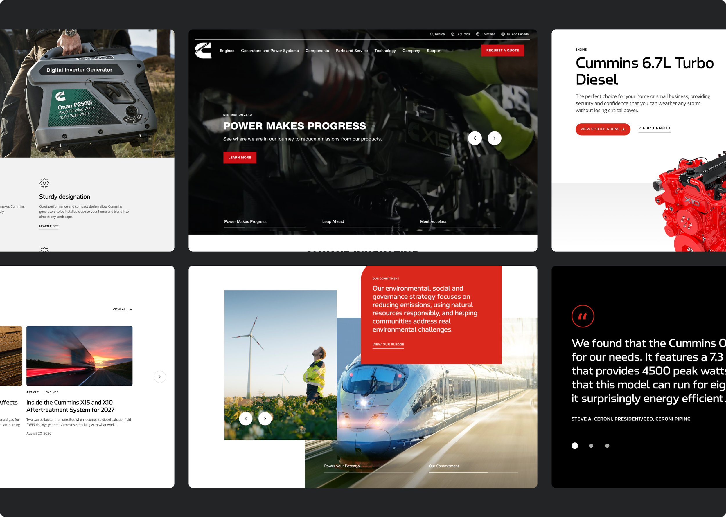
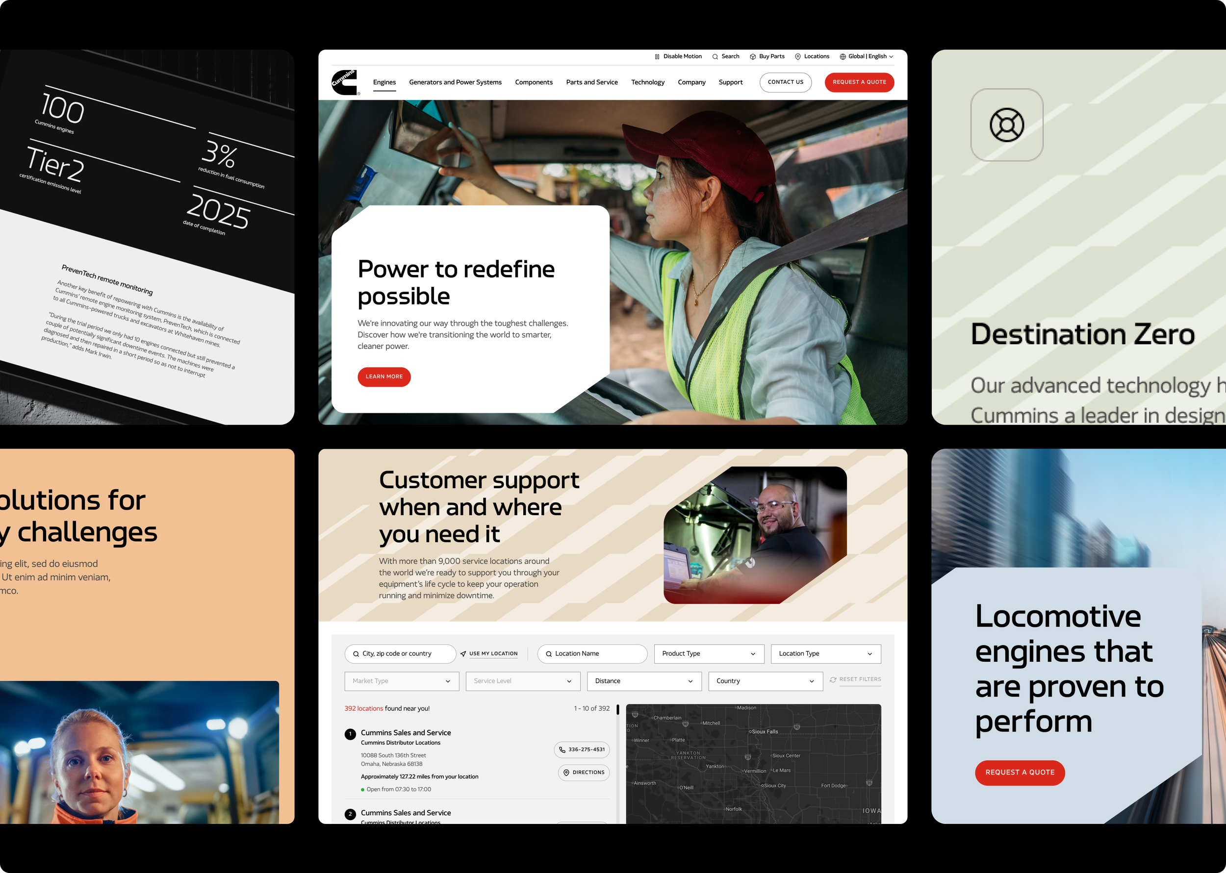
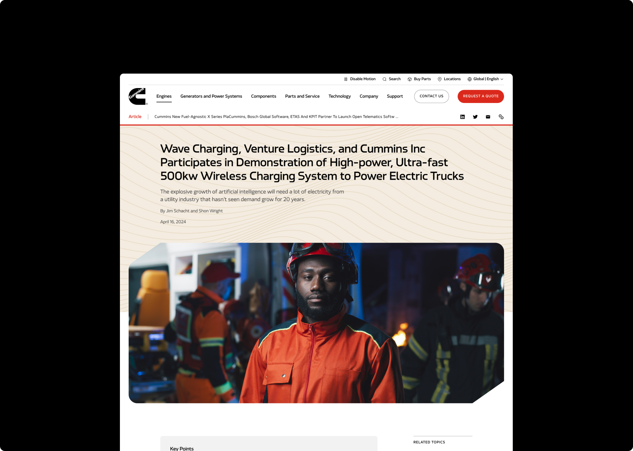
Rather than attempting a page-by-page redesign, I identified the key components that would carry the new brand furthest with the most efficiency. Media Monks had introduced the “Flex Frame” — a dynamic container concept built to direct focus toward a composition’s main content, flexible enough to hold anything from a single word to a full-bleed image. I led the redesign of Cummins’ two primary hero components around this concept, deployed across roughly 90% of the site. Paired with the brand’s new “Power Patterns” graphic system, this kept thousands of pages feeling fresh and on-brand without bespoke design work on each one.
-
The Component Library
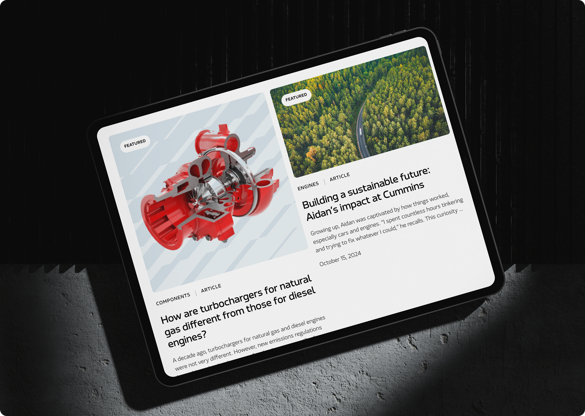
Beyond the hero, I led a sweeping refresh of the site’s component system — revamping the Masonry Grid, Product Finder Cards, Multi-Column Features, Scrolljack 50/50, Stats, Accordion, Product Carousel, Card Grid, News Feed, News Grid, Product Grid, Tabbed Media, and Full-Width Background Image components. I also designed eight entirely new components — including a Minor Hero, Featured Content, Press Resource Cards, a Photo Grid with background color variants, a consolidated Icon Library, Video Embed, a Color-Changing Statement component, and a Pause Motion feature in the navigation for accessibility.
The goal throughout was consolidation, not proliferation — fewer, more flexible components that content editors could use consistently, rather than a sprawling library that would fragment over time.
-
Pages Brought to Life
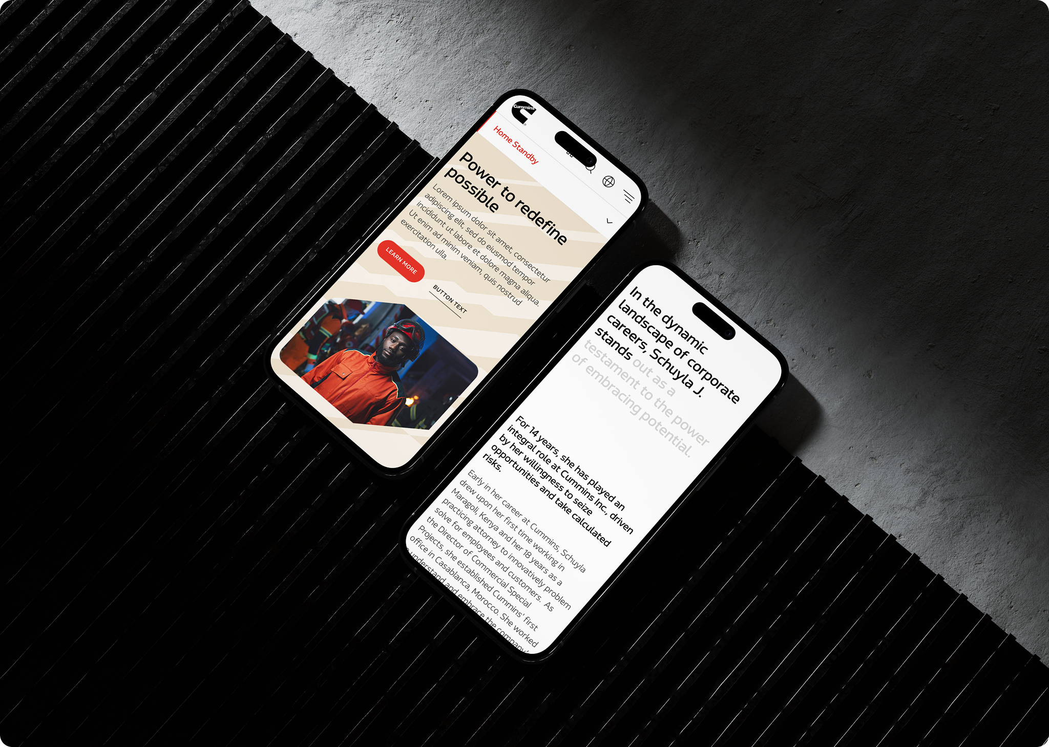
We revamped layout, SEO content strategy, and visuals across 8+ major pages — Engines, Components, Hydrogen Engines, Natural Gas, Solutions, Generators, industry and application landing pages, and About Us — along with a full Newsroom overhaul spanning the landing page, individual article and news release templates, and the news feed component. We also launched the Power Onward campaign landing page and a fully refreshed Homepage with new layout, components, imagery, and messaging.
“The team and the client are both constantly impressed with the direction Thomas takes components and with the way he introduces new, refreshing concepts in some pretty unexpected ways. Big shout out for constantly putting your best foot forward and always putting a ton of heart into your work.”
— Technical architect
What this project taught me
Cummins taught me what it means to sustain a creative relationship over years, not weeks. The work that matters most isn’t always the flashiest — sometimes it’s the unglamorous bridge system that lets a bold new brand identity coexist with a decade of legacy pages without breaking. Sometimes it’s sitting with a Creative Director and building consensus on a color-mapping rule, not just presenting a polished comp.
The thread connecting all of it: listen first, build systems that scale, and never lose sight of the fact that the people using what you design — customers and content editors alike — are the real measure of whether it worked.